Data visualization: exploration or communciation?
Data visualization is a common tool in a data scientist’s toolbox to explore data. A matplotlib scatter plot here, a seaborn boxplot there – visualizations help us the uncover secrets in our data.

However, in addition to exploring our data, we also often find ourselves in a position where we want to communicate about our data. Maybe you found that the customer satisfaction is going down over time, or perhaps there is an unexpected increase in sales of a particular product?
These are insights you won’t want to keep to yourself, but share with others who might benefit from this information. But how would you go about this? Would you present your audience with the raw data, rows and rows of numbers and values?
Probably not. Even though the information is all there in the data, the format in which you’re presenting it – a table – is difficult to distill. That’s why you utilised some form of data visualization in the first place!
Yes, you could elaborate on the data table shown in the presentation, and guide your audience towards the insight you want them to know about, but presenting the raw data doesn’t add much value. It doesn’t convince your audience; they still get the most important information – that is, what is important about what you’re showing them – from listening to you, not the slide.
That’s why we typically show a visualization instead. It shows data to back up your argument, but in a more presentable format.

> This is where things go wrong.
We tend to use the visualization that we used for exploratory data analysis, as our explanatory visualization in our presentation. But this exploratory visualization suffers from the same problem the raw data table did.
When you explore your data, you have the luxury of time. You can look at summary statistics, create different visualizations, spend time disecting the information on the graph presented to you, and make connections to insights you gathered before.
Please don’t expect your audience to do all that work, again. Help them out by directing their focus towards the interesting part. Some simple adjustments to your graph can help guide your audience’s attention towards the part of the data you want to talk about.
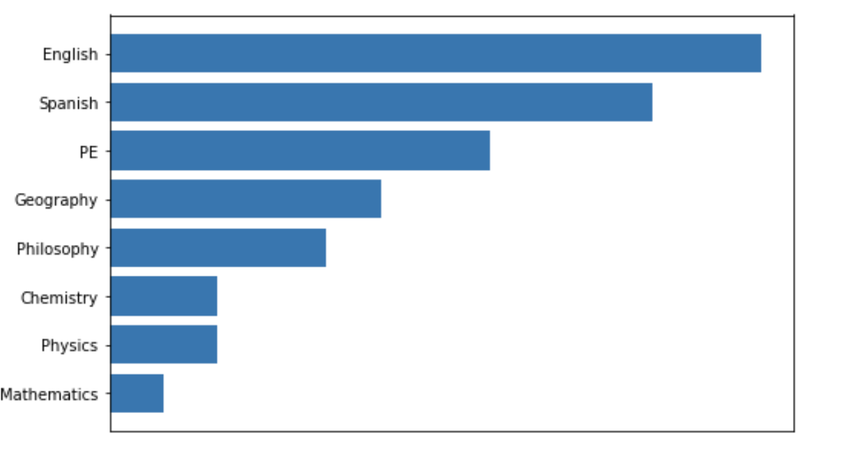
So instead of this…
… make it easy for them, and show them this:
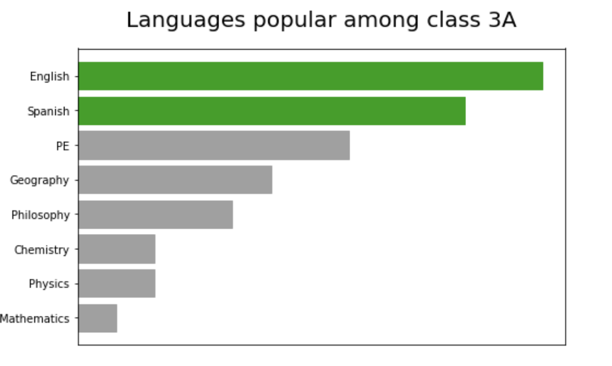
Now you and your audience have time to talk about what the next best action is to take, based on this insight, as you did not have to waste any time explaining why you showed them this graph. ☺
Takeaway
A great exploratory data visualization provides you with a lot of insight into your data. A great explanatory visualization draws the focus of the audience to what they need to know.
Want to know more? Check out my talk at PyData on Data Storytelling through Visualization for some simple tricks on how to transform your exploratory visualization into an explanatory visualization.